The First Thing Visitors See Is Losing You Business
Most hero sections get the order wrong. Here's the three-step sequence - and five real service business examples that show exactly how it works.
Someone landed on your website this morning.
They read the first thing on your page. And they left without getting in touch.
You'll never know who they were. You won't know what they needed, or whether they were exactly the client you'd want. You just know the enquiry didn't come.
That's happening every day on most service business websites. And the reason, almost always, is sitting right there at the top of the page - in the hero section. The bit before anyone scrolls. The bit that's doing more work than most business owners have ever stopped to think about.
Here's the thing. It's rarely a design problem. It's not usually a weak headline, or copy that needs polishing, or a button in the wrong colour.
It's a sequence problem. They've written it in the wrong order.
The Three-Step Sequence Most Hero Sections Get Wrong
There's a logic to how a cold visitor moves from "I've just landed here" to "I want to get in touch." It doesn't happen in one jump. It happens in three steps - and they have to happen in order.
Step one: stop the right person.
Not impress them. Not inform them. Stop them.
The first line of your hero section is a filter. It should make the right visitor think that's me - and let everyone else move on. That's not a failure. That's the job. If your headline could belong to any business in your sector, it's not doing this. It's decorating.
Step two: make them feel understood.
Once you've stopped the right person, they have one question: is this actually for me?
Most pages pivot straight to services, credentials, and years of experience at this point. Big mistake. The visitor hasn't been given a reason to care yet. Stay in their world a little longer. Name the problem they're sitting with - the specific one, not the category. Show them you've met their situation before.
Step three: ask them to do one thing.
One thing. Not three options. Not a menu.
A call to action earns its click when the reader already recognises themselves in what they've read. Before that, it's just a button. And the button should describe what happens next - not what they'll get eventually.
Attract. Engage. Convert. In that order, every time.
Most hero sections start at Convert and wonder why nobody moves.
Five Hero Sections That Get It Right - And Why
I built five hero section mockups across five different service businesses. Each one follows the same sequence. What's worth looking at closely is why each one works - and where the interesting differences between them are.
Because the difference between a hero section that converts and one that doesn't isn't always obvious. Sometimes it's one word on a button. Sometimes it's a headline that costs the reader something to ignore. Sometimes it's a trust bar that's answering questions nobody's asked out loud yet.
1. Haven Collection - Luxury Holiday Retreat
Image 1
Why it works:
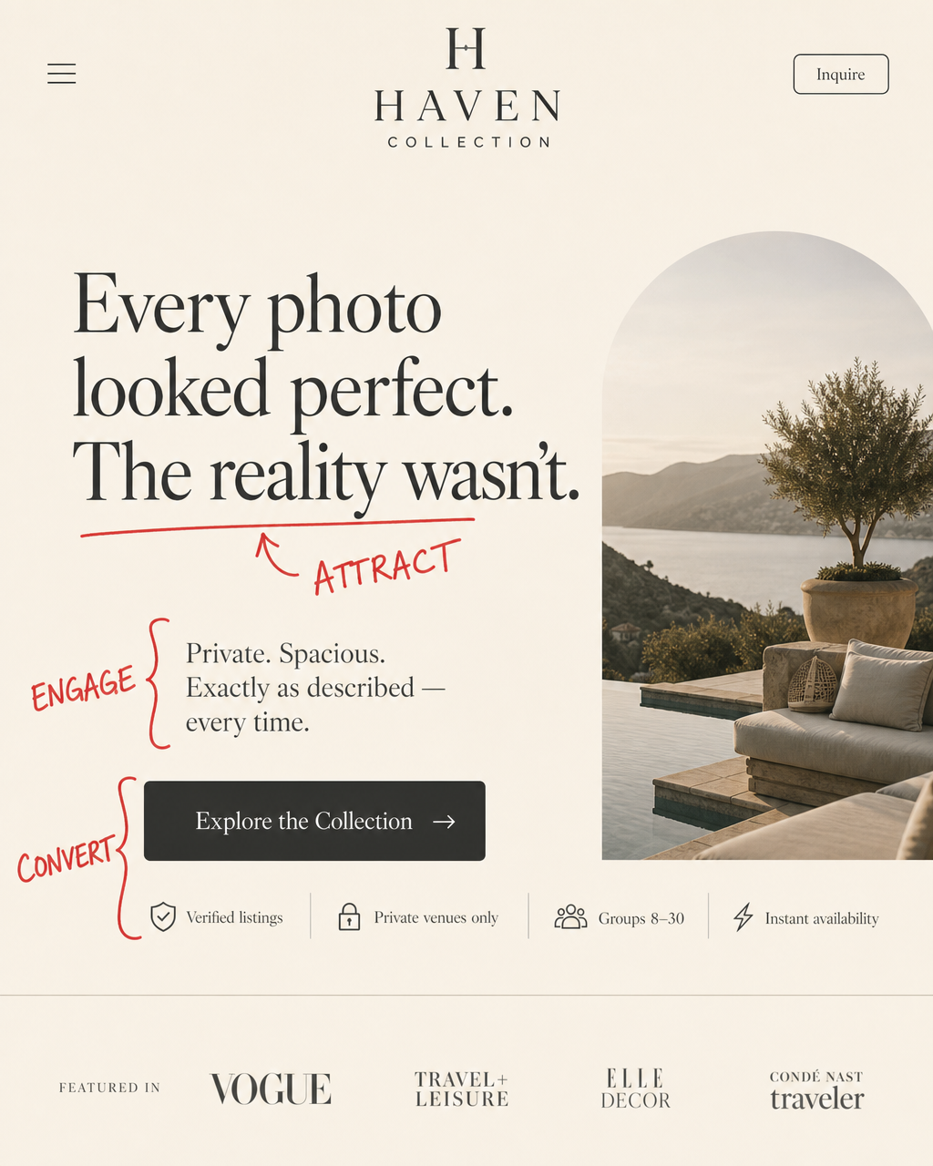
The headline - "Every photo looked perfect. The reality wasn't" - costs the reader something to ignore. Anyone who's booked a holiday rental and been disappointed recognises that line before they've finished reading it. It opens a loss without dramatising it.
The subhead rescues the tension cleanly: "Private. Spacious. Exactly as described - every time." That phrase - "exactly as described" - is doing quiet, specific work. It's a direct answer to the implied fear, not a feature list.
The CTA - "Explore the Collection" - matches where a first-time visitor actually is. They haven't been sold yet. They've been understood. "Explore" is an invitation. It doesn't ask for more than the page has earned.
The trust bar (verified listings, private venues only, groups 8–30, instant availability) handles four silent objections before anyone has to ask them. That's what a trust bar is actually for - not credentials, not reassurance. Pre-emptive objection handling. Every icon is answering a question your visitor is too polite to say out loud.
2. Clearfield Solicitors
Image 2
Why it works:
Most solicitor pages open with something like "experienced legal advice you can trust." Which is probably true. And which says nothing, because it's true of every solicitor.
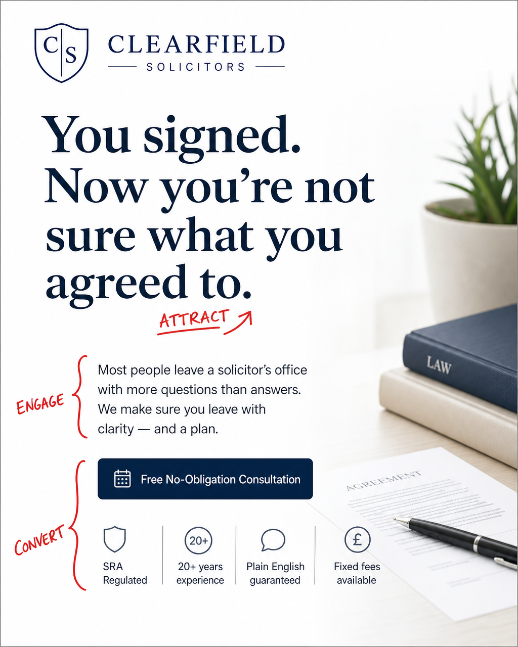
This headline names a specific, uncomfortable moment - the one that sends people to Google at 11pm. "You signed. Now you're not sure what you agreed to." That specificity does the filtering. The right reader stops. Everyone else scrolls past.
The subhead removes the blame before making the claim: "Most people leave a solicitor's office with more questions than answers. We make sure you leave with clarity - and a plan." Empathy first. Fix second. That sequence matters.
"Free No-Obligation Consultation" removes both friction points that stop people clicking: cost and commitment. The trust row - SRA regulated, 20+ years, plain English guaranteed, fixed fees available - answers the specific anxieties people carry into a legal situation. Not generic reassurance. Targeted reassurance, for that particular fear.
•••
3. Business Coach
Image 3
Why it works:
"You know what to do. You're just not doing it."
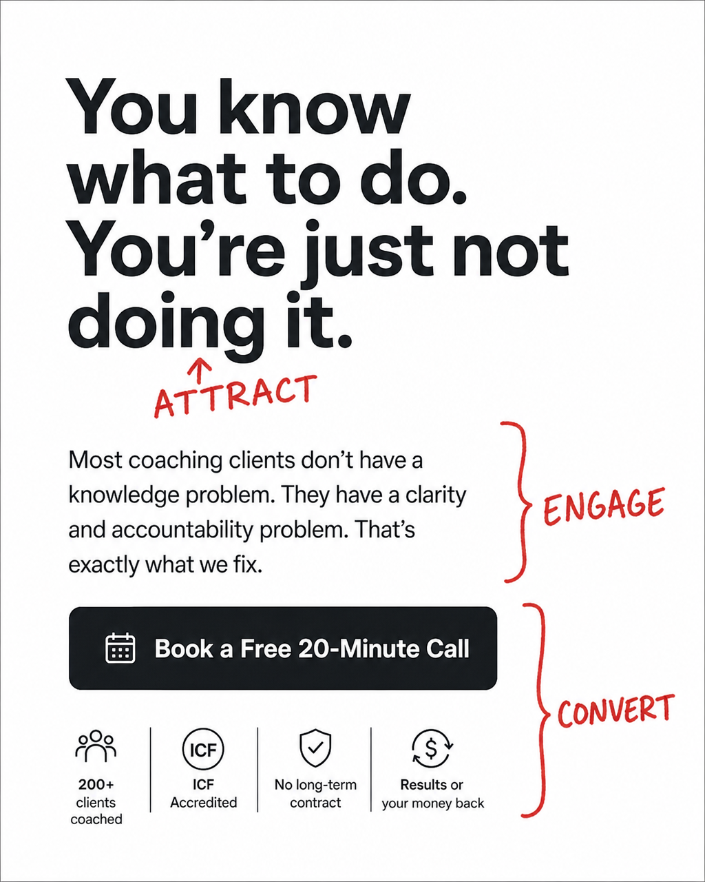
Arguably the most arresting headline of the five. Direct. Slightly uncomfortable. Precisely true for the right reader. It doesn't describe coaching. It describes the specific feeling that makes someone look for a coach.
•••
•••
The subhead does something worth noticing: it reframes what the visitor thinks they're buying. "Most coaching clients don't have a knowledge problem. They have a clarity and accountability problem." That's a paradigm shift in two sentences. It changes what the visitor believes they need - which is exactly what a good engage section earns the right to do.
The previous version of this had "Let's have a conversation" on the button. Warm. Vague. Does nothing to lower perceived risk or hint at value. "Book a Free 20-Minute Call" names the format, the cost, and the time. Three objections handled in five words.
The trust row adds what was missing entirely from the first version: 200+ clients coached, ICF accredited, no long-term contract, results or your money back. Coaching is a category buyers are actively sceptical of. The trust bar earns the click the headline attracted.
•••
4. ClearPath Mortgage Broker
Image 4
Why it works:
Five words. Yes or no answer. And if the answer is yes - which it is for most borrowers, most of the time - the reader's stomach drops slightly.
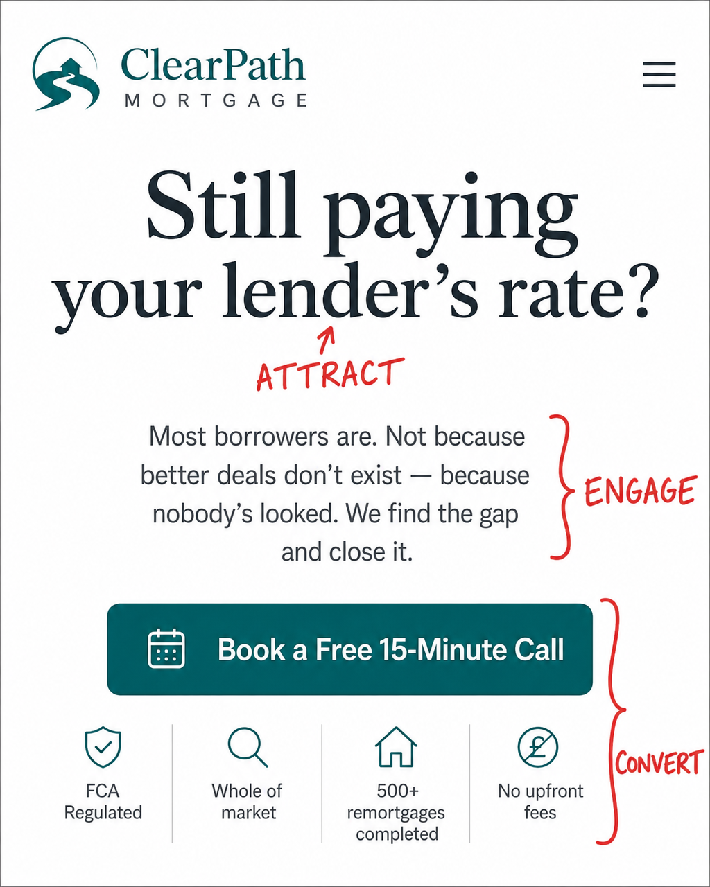
"Still paying your lender's rate?"
That's loss aversion doing its job. The visitor suspects they're losing money. They don't know how much. That information gap is what keeps them reading - not curiosity about the business, but mild, personal alarm about their own situation.
The subhead removes blame before making the case: "Most borrowers are. Not because better deals don't exist - because nobody's looked. We find the gap and close it." Three sentences. Empathy, diagnosis, fix. Nothing wasted.
"Book a Free 15-Minute Call" is the most friction-aware CTA in this set. It names the format, the price, and the time cost - pre-empting the question most people have before clicking anything financial. The trust row adds what the first version was missing entirely: FCA regulated, whole of market, 500+ remortgages completed, no upfront fees. For a financial decision, those four signals are doing heavy lifting. Without them, the entire page rests on the headline with nothing to catch the reader who wants proof before they book.
•••
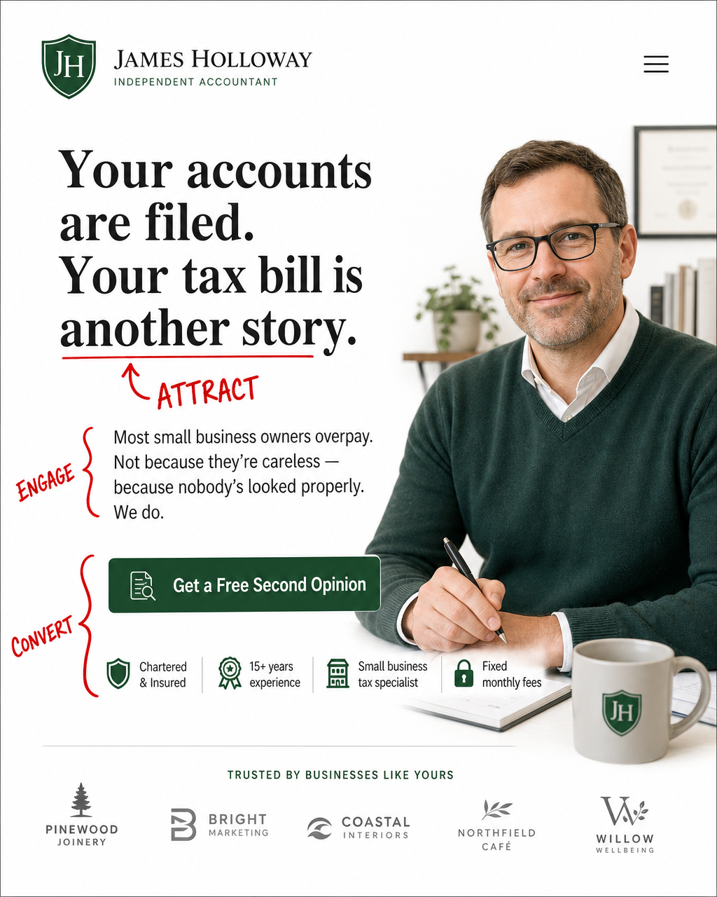
5. Independent Accountant
Image 5
Why it works:
This is the strongest converting hero section of the five. And the reason is the headline.
"Your accounts are filed. Your tax bill is another story."
It doesn't state a problem. It implies the reader is currently losing money - and that the loss is ongoing, fixable, and nobody has told them yet. That combination - loss, information gap, implied resolution - is about as powerful as a headline gets. It doesn't describe a category of person. It describes their specific financial situation, right now.
The subhead does textbook work: "Most small business owners overpay. Not because they're careless - because nobody's looked properly. We do." Removes blame in one clause. Closes with a two-word claim - "We do" - that lands harder for being so short.
"Get a Free Second Opinion" is the standout CTA of all five. Not because of the word free, though that helps. Because of "second opinion." It frames the first step as getting something rather than giving time or money. It implies there's already an existing opinion that may be wrong - which there is, for most small business owners who've never had their accounts reviewed critically. Low friction. High perceived value.
The trust bar - chartered and insured, 15+ years, small business tax specialist, fixed monthly fees - answers the specific questions a nervous small business owner carries into any accountant conversation. Not generic credibility. Targeted reassurance for that reader's specific fear.
•••
The Pattern That Separates the Best from the Rest
Look across all five and something becomes clear.
The two strongest headlines - the accountant and the mortgage broker - work by making the reader suspect they're currently losing money without knowing it. Loss aversion plus an information gap. The headline costs them something to ignore, because ignoring it might mean ignoring an actual problem.
The pages that convert best name the value and the cost on the CTA. "Free second opinion." "Free 15-minute call." Not just an action. An offer. One word shifts the psychology from you're asking me to give something to you're offering me something. Risk-reversal belongs on the button - not buried in the small print below it.
And the trust bar. Most businesses treat it as credibility display - a row of logos and qualifications to make the page look professional. That's not what it's doing in the pages that convert. It's answering the specific, unspoken objection that this particular visitor carries. A solicitor's visitor worries about being overcharged. A mortgage visitor worries about being mis-sold. An accountant's visitor worries about whether they're getting generic advice. The trust bar that handles those worries - specifically - outperforms one that just says "experienced and professional" every time.
•••
What Does Your Hero Section Actually Say?
Open your website on your phone. Right now. The way most of your visitors will see it.
Read the first thing they read.
Does it stop the right person - specifically, not generally? Does it name their situation closely enough that they feel understood rather than categorised? Does the CTA offer them something, or just ask for something?
Three questions. But here's what I'd add: if you're reading the top of your page and it could belong to any business in your sector, that's not a voice problem or a design problem. It's a sequence problem.
And sequence is fixable - faster than you'd think, once you know what you're looking for.
If you want a second pair of eyes on yours, that's exactly what we do. [Book a free call with Jon →]
•••
•••
Questions worth asking
•••
J
Written by
Jon Young
Jon Young has spent twenty years watching expert UK service businesses lose ground to competitors who were louder, not better. He built Decodefy to close the gap between what professionals know and what they manage to say publicly - starting with a proper conversation, not a form. If your expertise isn't showing up online the way it does in a client meeting, that's probably the conversation worth having.